NBC Logo Evolution: What We Can Learn
A logo, whether it’s a symbol or letters making up a wordmark, functions as a kind of branding shorthand. Logos that generate an emotional attachment in our minds tend to endure; brands that can adapt without losing that long-term cultural hold are especially noteworthy. One prime example is the National Broadcasting Company, better known as NBC. It may have been born in the early days of radio, but it has a lot to teach today’s designers.
NBC has used many corporate logo variations since 1926, when its radio network began transmitting programs across the country. These identity developments—not all of them successful—reflect the history of science and technology in entertainment.
CHIMES THROUGH TIME
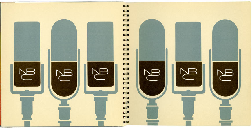
From 1926 to 1946, the graphics speak to the network’s identity as a radio station, showing a microphone “broadcasting” sound waves as little zigzag units radiating outward. People were captivated by the idea that these invisible things, the recently developed technology of radio waves, could travel through the air carrying news, music, and entertainment into their homes. Back then, radio was the most powerful form of mass communication, the only medium that reached the public live in real time.
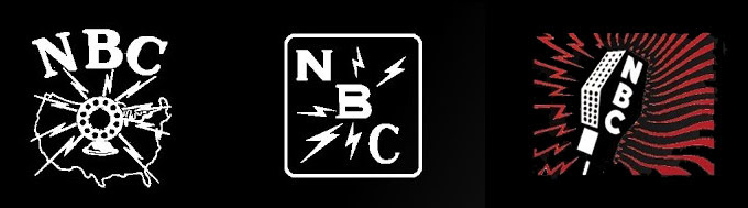
These NBC lodos date from 1926, 1931, and 1942,
From the start, NBC was identified by its on-air chimes striking the musical notes G-E-C, the first sound ever to be awarded an audio trademark. The chimes persisted through the decades and were used on NBC affiliate radio stations until the late 1980s.
Justin Peters, executive creative director of Carbone Smolan Agency (CSA), is an expert in solving complex branding challenges. He says, “The chimes are a piece of NBC’s identity consistent since day one. The fact that the sonic component survived is an amazing example of brand endurance. When color television was introduced in the 1950s, the network came up with a way to communicate how they were leveraging technology and programming through the icon of a proud, plumed peacock. The chimes didn’t conflict with the bird—NBC married the two throughout the brand’s evolution. Keeping those radio roots and brand equity throughout time helped make NBC one of the most recognizable identities in the world. It’s a great balance of story, utility, and technology.”
Although television was invented in 1927, TV sets did not become a fixture in American homes until the late 1940s. At that point, the NBC logo lost the microphone and sound waves to become letters only—a visual holding pattern, as if the network was biding time while trying to figure out how to represent the new technology. In 1954, a partial image of a xylophone, its key lettered N B C, provided a literal counterpart to the network’s chimes. As Peters points out, “This one is basically illustrating the tones. It’s not deep—it’s just a memory trigger for a well-known sound.” The xylophone logo is a transitional image, abstracted, referring to sound but not depicting a radio or radio waves. It’s not a new story for the network, just another way of showing the same thing.
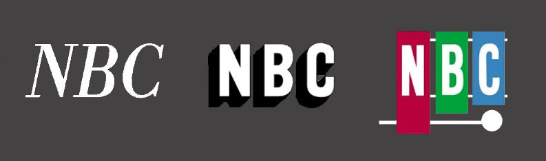
NBC introduced these three wordmarks in 1946, 1952, and 1954.
THE PEACOCK’S EARLY DAYS
In 1956 the NBC peacock, created by in-house design director John Graham, unfurled as a showy boast for the network’s new color broadcasting capabilities. One of the bird’s great strengths was its design flexibility, especially as a starting point for animation. As a brand ambassador, the bird persisted alongside several other conceptual directions over the years, often taking a back seat but never officially retiring.
John Graham’s original peacock tail had 11 colored segments topped with diamonds that opened up into paintbrush-shaped finials. Standing in partial profile, it also had feet, a head plume, and a large body.
THE SNAKE
1959 ushered in the era of the Snake, a sinuous combined wordmark typical of mid-century corporate branding, also designed by John Graham. Steve Heller (author, design historian, and co-chair of the MFA Design Department at School of Visual Arts) says, “Those were the days when everyone was trying to match the CBS Eye designed by Bill Golden—it was the crème de la crème. Paul Rand’s ABC logo was fine and distinctive, but NBC seemed to have the biggest identity crisis.”
The Snake in a brand manual of the time, courtesy Milton Glaser Design Study Center and Archives, School Of Visual Arts Archives, Visual Arts Foundation.
Pentagram partner Michael Bierut, who has created or refreshed identities for many well-known brands, says, “That triple NBC ligature is really handsome in the non-figurative tradition of the ABC logo, where Rand took the first few letters of the alphabet, redrew them based them on a circle, and put them inside another circle. There’s no idea behind it except this pleasing geometric configuration.”
Unlike the peacock, the Snake didn’t communicate the mission of NBC, a network devoted primarily to entertainment. “The CBS Eye portrays clear objectivity, in line with their tradition of broadcast news that we associate primarily with great journalists like Walter Cronkite and Edward R. Murrow,” Bierut points out. “CBS carried some entertainment programming, but the news tradition is the real heart of CBS. NBC is much more fun, more about entertainment. A peacock struts and shows off. It’s not about objectivity; it’s all, ‘Look at me, I’m pretty!’ That logic gave NBC permission to be purely about entertainment. There’s something embedded in the peacockness of the peacock that matches up really well with the network’s programming.” Despite this metaphoric alignment with the network, the peacock was not considered the official NBC logo until years later.
THE TRAPEZOID N AND THE PROUD N
The Snake lingered through 1975 and was then replaced with a logo known as the Trapezoid N, designed by Lippincott & Margulies at a reported cost of $750,000. The new logo was identical to one already in use by Nebraska’s public television station ETV, except for a slight color variation. ETV filed a trademark infringement suit and NBC settled out of court, giving $800,000 worth of new equipment to the Nebraska station along with a $55,000 payment to cover the cost of creating a new logo. In return, NBC was allowed to keep the “N” logo. Talk about an expensive crow to eat.
In case you think logo bashing is a modern sport, the Trapezoid N (seen to the left) met with widespread derision at the time; for example, Saturday Night Live host Chevy Chase mocked the new logo during Weekend Update as Gilda Radner tap-danced her way onstage wearing a trapezoid N-shaped costume covering all but her arms and legs.
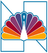
A few years later, NBC followed up that mistake by making an even bigger one. 1980’s Proud N (left) was a worst-of-both-worlds mashup that reintroduced the peacock, still with his 11 tail plumes, superimposed on the split trapezoid N.
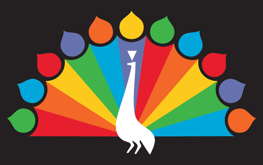
This logo was discarded in 1986 when Steff Geissbuhler, a partner at Chermayeff & Geismar Associates, provided a decisive rebranding for NBC that turned a drawing of a bird into one of the world’s most recognizable graphic symbols. Geissbuhler agrees that the Proud N was a poor graphic solution. “It’s the N for Nothing: By trying to say too much, it says nothing at all,” he says. “The N looked like X-Acto knife blades—a typical abstraction trying to be Swiss, without understanding the problem at hand or design principles, trying to make it look modern. The combined logo was not reproducible at small sizes, it was not good on camera, and was overall too complex in form and meaning.”
THE PEACOCK RESURGENCE
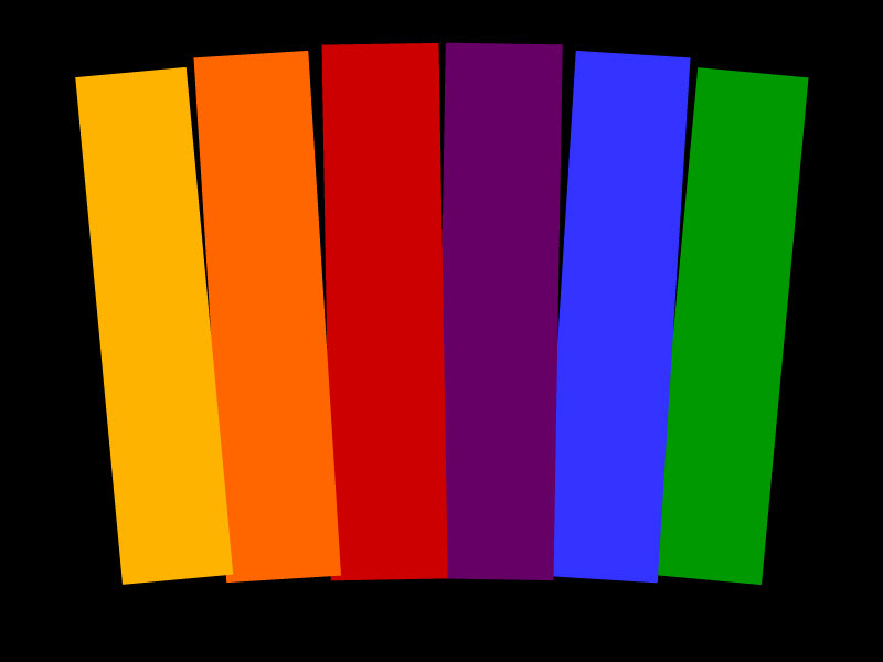
“Steff Geissbuhler brought in that Swiss sensibility and simplicity,” says Peters. “Flat color forms, reducing the number of plumes from 11 to six, for NBC’s six divisions: News (yellow), Sports (orange), Entertainment (red), Stations (purple), Network (blue), and Productions (green). He brought beauty and utility together, all crafted in a way that was easy to implement and manage from a brand governance point of view.” Beirut says, “I think Steff did something that was really not obvious at that moment in corporate design history. He said, ‘Wait. You can do a nice, clean version of the peacock.’ And he did the one that endures to this day.”
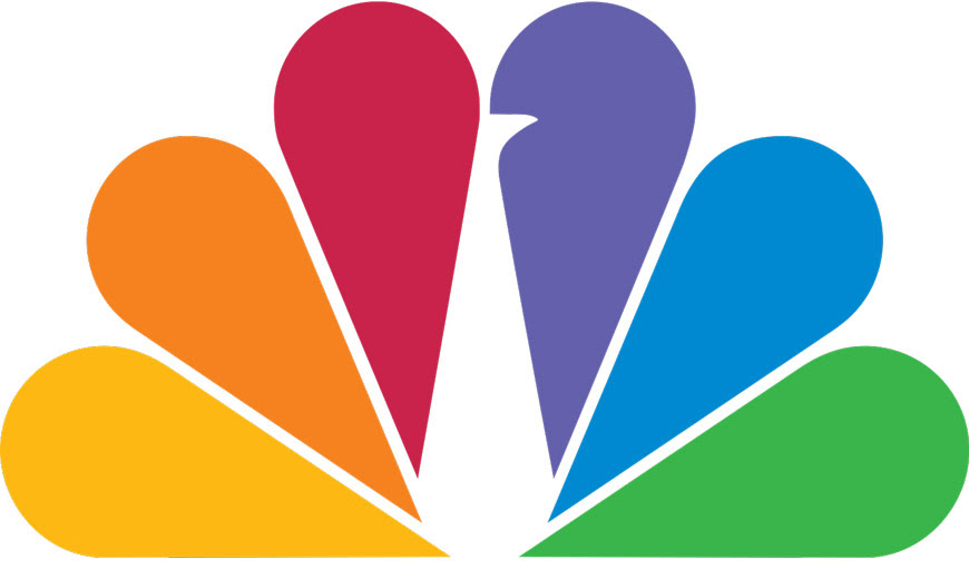
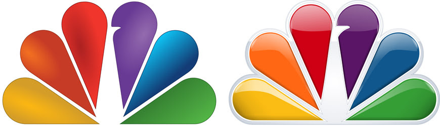
“NBC knew they had an incoherent mess, but they didn’t know how to change it,” Geissbuhler recalls. “While we considered other solutions, including just the acronym as a wordmark, we realized that the peacock was truly the most appropriate for NBC’s entertainment-focused programming. The male peacock is a great show bird, but it had to be simplified. I used a repeated teardrop form for its tail, in six colors representing the bars of TV test patterns, to make a fan and then used the same form for the body. I attached a little beak, and that’s that.” He also switched the direction of the beak so the peacock is looking to the right, into the future.
Geissbuhler redesigned the letters NBC as well, adjusting Futura characters to make them unique to the network. “I believe they still call it NBC Futura,” he says. “We made photostats of the alphabet and indicated our changes in pencil on tissue overlays: for example, we sharpened the points of the N and shaved the sides of the C. A type specialist then redrew them by hand and inked and refined the font. To this day, people try to guess what it is.”
Geissbuhler and his team customized Futura characters by hand so that the lettering was unique.
Despite the thought and care lavished on the logo, NBC head Fred Silverman was too fearful to implement it because the network was third in the ratings. Things changed when Grant Tinker took over as network head in the 1980s. He asked Chermayeff & Geismar to present the project to the corporate board for a second time—the next morning. “It was a Wednesday evening at 5 PM,” Geissbuhler says. “Everything was in color slide format! We had to dig up the slides and re-organize them and think about what to say this time around.” But Tinker loved it and the board agreed to move forward with the new design. Small hitch: it was summer, and the executives wanted the new logo ready for the fall TV season. Wisely, Chermayeff & Geismar pushed back and convinced the network to postpone rollout until a thorough brand manual could dictate the logo’s use.
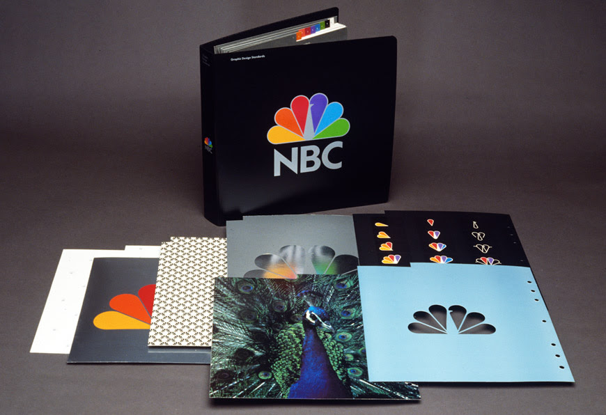
A few examples from the extensive brand manual for the 1980s logo, courtesy Steff Geissbuhler.
The peacock has been the canvas for a stunning range of reinterpretations: a rainbow of M&Ms, a balloon version created by Jerry Seinfeld, a bunch of feet in colored socks, a TV dinner with feather-shaped compartments filled with colored jellybeans, and more. The peacock also once provided a humorous introduction for the network’s comedy shows, as in a version where the bird sneezed so hard that he blew off his tail feathers.
WHAT’S NEXT FOR NBC?
The 1980s version of the NBC logo is still in use. Of late, its tail has seen additional treatments—gradients, glass-like transparency effects—to render it dimensional for HDTV. Bierut says, “The peacock started out flat, which made sense, but now it’s gotten all round and shiny. Maybe there’s a big network look that these things need to have, that has to do with shininess, and with demonstrating production values at all cost. Flat looks cheap, but it takes a little bit of extra effort and presumably money to do highlights and modeling to render each feather of the peacock. It’s sort of like the equivalent of a rotating, flashing siren on top of a police car: shiny and loud, red and pulsating.”
Despite these recent design affronts, the bird is still with us because it works on many levels: conceptual, visual, and perhaps most important, emotional. But does that guarantee its continued health? “It’s really hard to wean people away from a symbol they feel affection toward,” says Bierut. “If you make it go away, people take it personally, as if there’s this violation of trust, as if something they love has literally been killed. So I’d keep the peacock and let it serve as a starting point, a true north to build out a whole confident design language. There’s no reason why the peacock couldn’t run the gamut from something very flat, concise, and telegraphic that would reproduce well small, all the way up to something full color and expressive.”
Another approach would be to introduce different personalities and renderings of the peacock related to different kinds of programming, showing a variety of voices through the same familiar character. Peters says, “I’d give it some room to speak more directly to specific audiences. And that’s so important today, that you’re not a generalist, that you understand the tribes and communities that seek, create, and engage with content.” Geissbuhler agrees. “I would look at where the company is heading. It’s not just straight TV anymore; this tree has grown in all directions,” he says. “There’s MSNBC, local stations, NBC Sports, all the different divisions. The nature of the broadcast beast has changed, but I would still keep the bird a while longer—it can exist for a long time if you use it intelligently.”
When radio was the only game in town, one simple logo was enough to represent NBC’s place in the broadcast world. Today’s widespread market practically demands a logo with built-in flexibility. Tracing the NBC logo’s path since 1926, from radio to network television to multiple media markets, is a look at a visual identity that reflects the nature of its industry’s underlying technology, provides an intimate look at our entire culture along with snapshots of prevailing design trends and thinking along the way, and gives us an idea of where we’re headed next. The bird abides.
We Can Be
Great Together
QUICK LINKS
610-692-1810
705 E. Union Street
West Chester, PA 19382
We Can Be Great Together
610-692-1810
QUICK LINKS
705 E. Union Street
West Chester, PA 19382